
I’ve been living in London for over 8 years now and have wanted to visit The Museum of Brands, Packaging & Advertising since I first moved to the city.
I finally carved out some time recently to visit and decided to take a little mid-week holiday and get myself down to Ladbroke Grove. I’m pleased to say my visit was not a disappointment. The museum has a vast and equally fascinating collection displaying branding, posters, adverts and packaging from the Victorian era to the present day.
Visitors walk through a sort of time tunnel – literally and metaphorically as the large portion of the collection is displayed within what I’d describe, as a long and winding glass corridor. There are all kinds of brands on display, from well known cleanings products to liquorice all sorts. From war time paraphernalia to Spice Girls memorabilia. It’s all there!
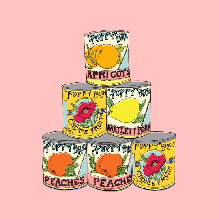
What I found most interesting was seeing some of the products and brands that had stood the test of time, and seeing how their image had changed and evolved over the years. As some one who enjoys their food, and very much enjoys illustrating it too, I was drawn to the confectionery section which housed packaging which I remembered but had long forgotten.
Cadbury’s packaging and it’s Dairy Milk bars was a much simpler affair back in the early days, almost unrecognisable but for the signature ‘Cadbury’s Purple’ and the synonymous ‘Cadbury’s’ logo.
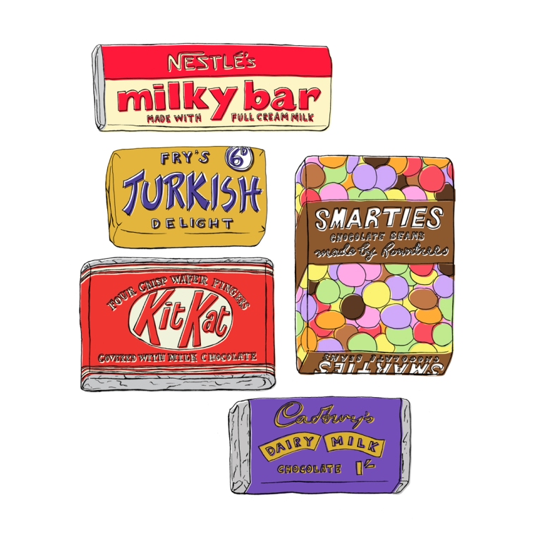 I also remember my Grandparents buying boxes of Smarties like those above on special occasions. Confectionary tends to come in resealable pouches these days, but I remember being fascinated by my Grandad’s ever-present box of Maltesers that he kept beside his armchair in the living room.
Breakfast cereal was also something I remember being obsessed by as a child. Arguing over who was going to have what from a Kellogg’s Variety Pack was a regular occurrence in our household. Frosties were always considered the best of the bunch. I myself didn’t really like Frosties however, I found them too sweet and didn’t like that they made the milk turn sweet. But having an older Sister meant that I often ate them anyway, simply because she would.

Seeing the evolution of Tony the Tiger was also very interesting. He evolved from a quite angular and stylised looking Tiger, to then becoming the more bulked out and smiley Tony that we have today. And I have to say, I think I preferred Tony back in the early days. He looked more cheeky and the design felt sleeker.
Also on display were a range of tinned soups and other foods from brands such as Heinz. The Heinz Real Turtle Soup was one of my favourites and I found this snippet from britishfoodhistory.com explaining the history of this surprising soup:
“…turtle soup had become immensely popular in the 1750s after sailors coming from the West Indies landed a couple of them upon British soil. Sailors would catch them and keep them alive on their ships as a source of fresh meat. They were very delicious, and it’s a surprise that any even made it back. Those that did, were readily snapped up by royalty. Now everyone wanted to get their hands on one and suddenly no banquet or dinner party was complete without its turtle soup. At its peak in trade, 15 000 live turtles were being shipped live from the West Indies per year. Of course, these huge beasts were very expensive, and because such numbers were being caught, trade was not sustainable and the green turtles were almost hunted to extinction, driving up price even further.”
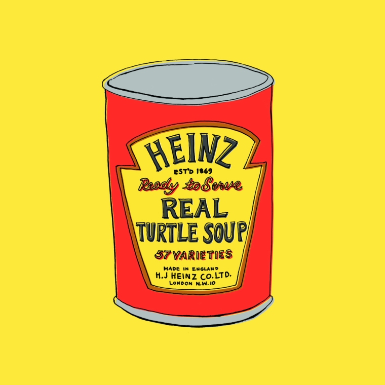
Due to this, the more familiar Mock Turtle Soup was created as an attempt to mimic the flavour of Real Turtle Soup, as real turtle soon ceased to be a viable option for most people. Calves head seems to have been one of the staple ingredients of Mock Turtle Soup amongst other cuts of meats.
I also enjoyed all the detergent packaging. I think it’s hard to view 1960’s household brands without associating them with Andy Warhol’s infamous ‘Brillo’ screen prints and 3D installations. The design back then really was much simpler. A very limited colour palette was often used, usually of only three colours. The text was very minimal and concise.

At The Museum of Brands, Packaging & Advertising there was so much to see, even a section at the end devoted entirely to One Direction. Right now it’s hard to have a perspective on these later brands and products, and to really understand their cultural significance. But 30 or so years from now people like myself will be looking back on those things, and reflecting on how much things have changed in the world of branding and packaging design.
Go visit now!
The Museum of Brands, Packaging & Advertising
111-117 Lancaster Road
Notting Hill
London
W11 1QT
www.museumofbrands.com
